Infographic By My Design
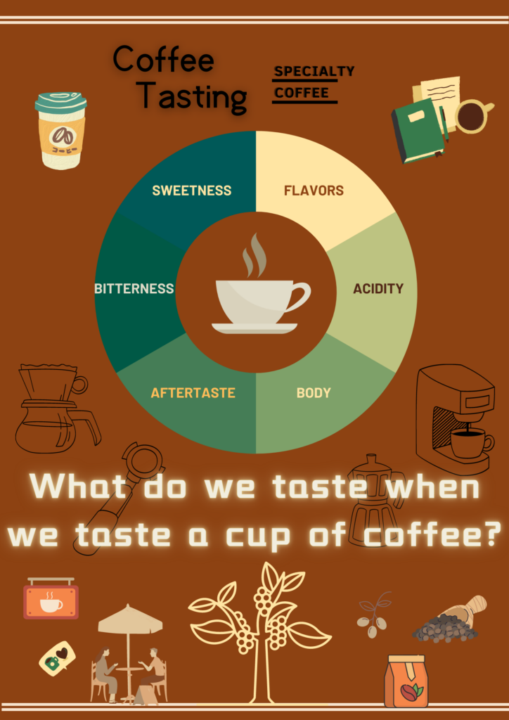
Above is an infographic I designed using Canva about coffee tasting. In this infographic, I tried to balance the images and texts in a symmetrical way so that the whole image looks comfortable and balanced. I made bigger the two main contents the wheel and the question “What do we taste when we taste a cup of coffee?” and put them in the middle of the infographic so that the viewers could instantly see the information that I would like them to spot first. I also tried to make the content simple but informative by using limited texts with different sizes so that when the views see this infographic they could immediately see the information they are looking for. For the colors and background, I used dark background and made the texts stand out by using colors that contrast the background. I also used colors that align with one another to create a harmonious feeling throughout the whole picture.
Good vs. Bad Infographics
As for the World’s Worst PowerPoint Presentations, one thing they have in common is that they are wordy and messy. They seem to be the presenters’ script rather than PowerPoint slides. Whether it is true or not, the slides give the audience the impression that the presenters have not organized their ideas properly before they are ready to present them. When I look at the slides, I found myself lost in the massive texts and could not find any key point on the screen. I imagine it could also distract me from the presenters’ speech because I could be distracted by looking for information in the slides from listening to the speakers.
I think infographics are similar to PowerPoints in the way that they are more than texts which are only presented by bricks of words. Infographics and PowerPoint can both be multimedia learning contents combining words, graphics and sometimes even sounds in a thoughtful and organized way which involves logic and psychologic features with regard to people’s reading and conceptual habits.
Whether when we are designing infographics/Presentations or evaluating them, thinking of ourselves as the viewers or listeners could be a good way to judge whether our designs are good or not. Just as the presenter David JP Phillips said, we want to design infographics/slides that we could see and feel “Ahh” rather than “Ugh”.
3 Responses to “Blog Post #4: Design Principles for Multimedia Presentations & Canva Poster Sharing”
Hi Qiaoyang,
I have to say your infographic is really good. First of all, your information is neat and concise. As an audience member, I can see at a glance what you are trying to convey. Second, although the background color of your infographic is dark, your font is always easy for the audience to read.
When I’m creating my infographics, I always have trouble finding the right illustrations to help my audience better understand my topic. I want to ask you, how do you find these illustrations that match your background color?
Junyi Ma
Hi Qiaoyang,
Your design is really nice,Your design is really good, first of all your color choice is very good, it makes me think of coffee at a glance, it is very suitable.The illustrations and designs are also clean, allowing readers to get straight to your subject.
I have some small questions when looking at your infographic content, why not write some descriptions under the title? I think this will make the infographic more complete
Shaomiao Yang
Hi Qiaoyang,
I have to say that your infographic is really good and then content is clear and concise, so that views can understand what you are trying to convey at a glance, and your background colours and illustration are in line with the theme. Even though your infographic has a little flaw, I would like to say to you once again that you did a great job!